Semicolon house

Semicolon house is a second-floor dwelling in an 75 year old art deco building in Adarsh Nagar, Worli. Built by the Bombay Housing Board, these were Lower Income Group homes for small families coming to Bombay. These homes were originally built as 450 Sq.ft spaces, divided into Balcony, Room, Kitchen, Bathroom, and Toilet. In the years preceding the “BHK” style of housing now prevalent, homes in Bombay were far more fluid in space usage, and families used all their available space in multiple ways. The balcony was enclosed by windows all around, and allowed one to fully open up, or be fully enclosed. The middle room served as both a living, and sleeping room, with a dedicated almirah embedded in the wall. The kitchen was spacious, and allowed for even the bulkiest old Indian cooking paraphernalia. The bathroom, and toilet were separated to make space for larger families to use them. The height of each unit is a generous 10’-6” and its old teakwood door, and window frames had ventilators above for good ventilation. Some of the buildings have been extended about six feet to use additional FSI granted in 1995. (It still uses far less than permissible)

Pranav has lived in Adarsh Nagar since he was one, earlier in a smaller tenement, and later in one of the units described above from age five. The neighborhood is well planned, with plenty of trees, green spaces, a market, and very well connected to the whole city by public transport. In 2015, after a search for years, he finally found an apartment in one of the buildings similar to the one he lived in already, with its windows opening up to a large public park, and plenty of trees. The apartment was also mostly unchanged from its original configuration, and all its windows, doors, and even the steel almirah in the wall were intact.

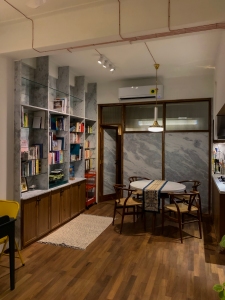
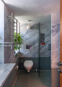
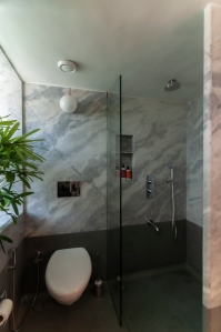
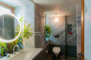
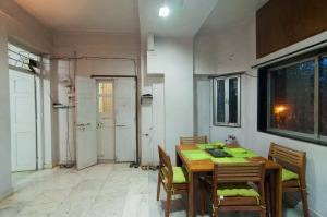
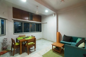
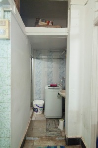
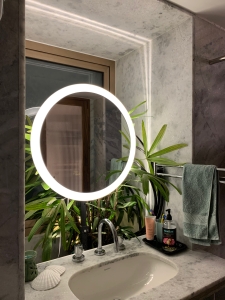
In 2020, he decided to remodel the space with the same idea of space utilization, of a balcony space, a fluid in-between room, that flows seamlessly into the kitchen, and the kitchen designed to foster conversation around cooking, while being across the library, that brings the whole space together. The bed is separated from the main space by an uneven partition that feigns thickness, while bringing the two spaces together while maintaining privacy. The bathroom is now in an axis perpendicular to the original, but has two doors- giving it access both from the bed space, and directly through the kitchen, for guests. The kitchen itself moves further into the center of the apartment, where, like the original, it can expand to serve many functions. The middle room is now kitchen, dining space, and library. The entrance originally opened up into a balcony, and now has a dedicated space as entry foyer, that opens up into an enclosed verandah, study, and greeting space.

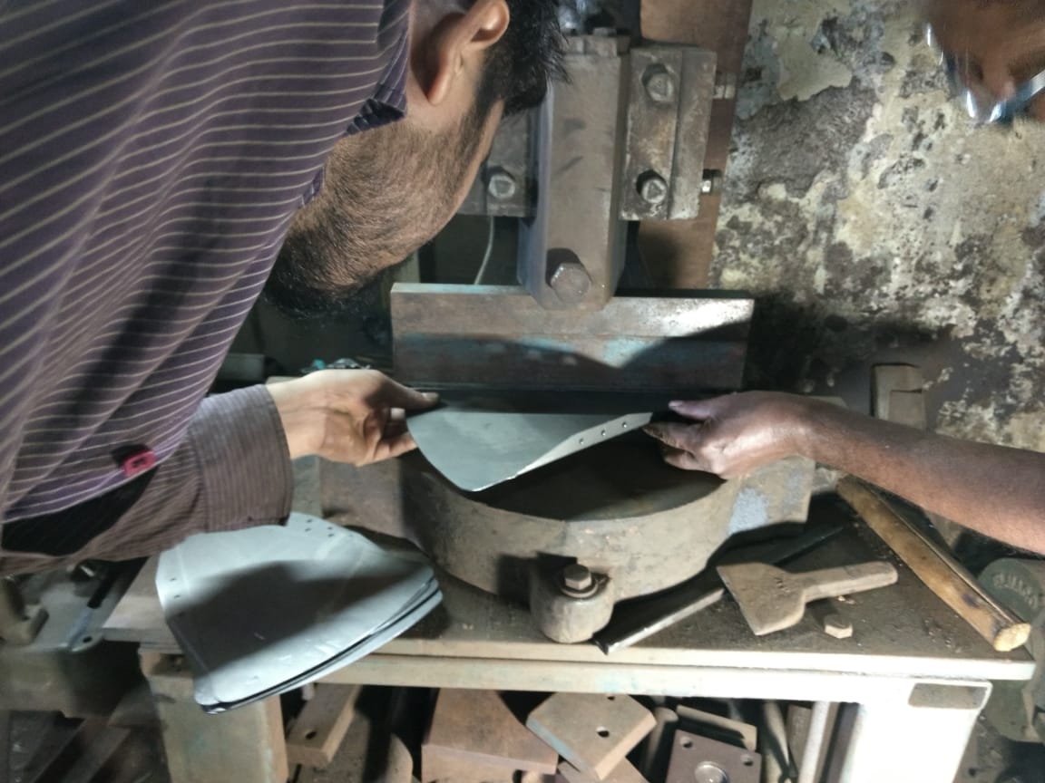
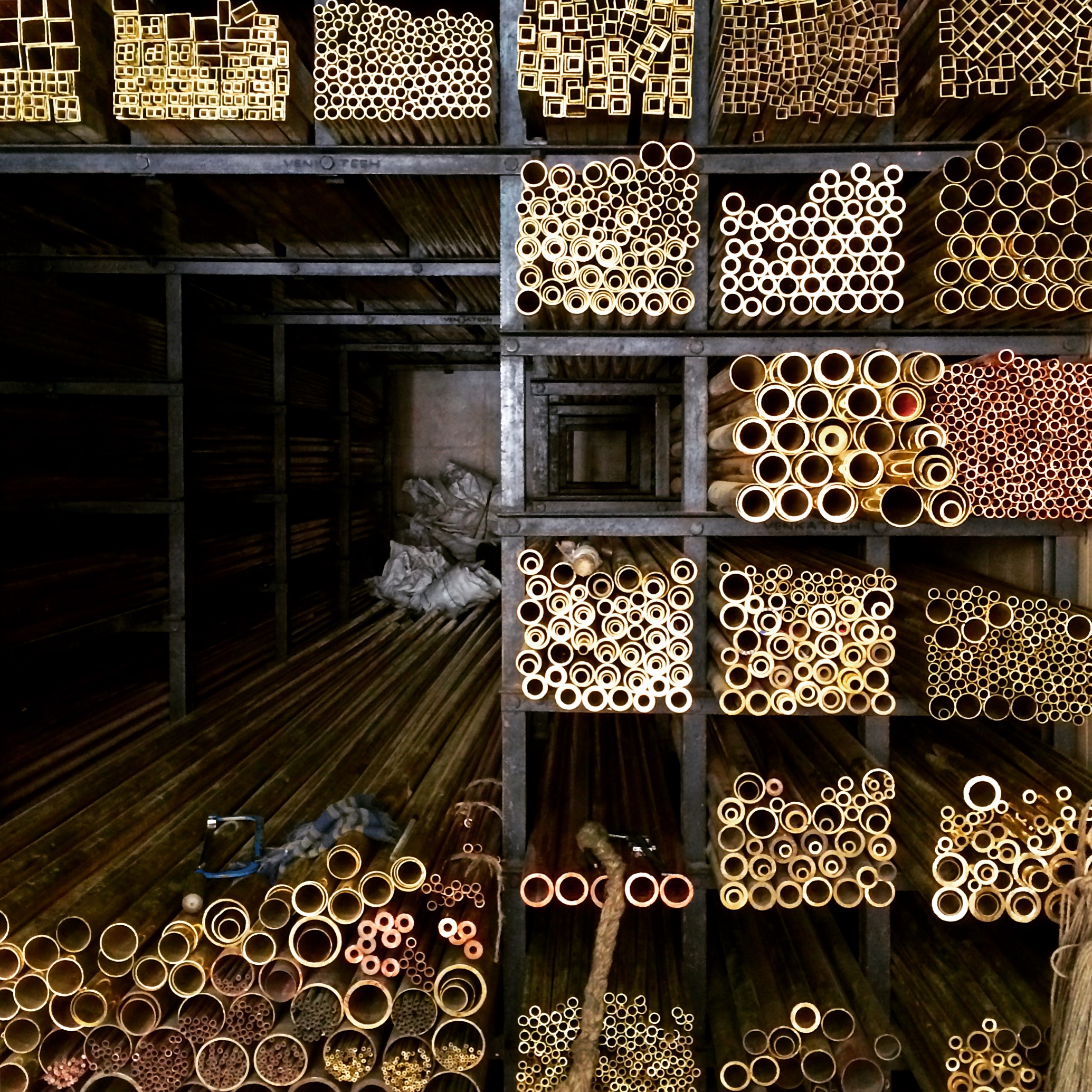
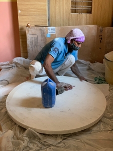
As always the studio was restrained with the use of material, using marble, kota (limestone), teakwood, and brass. Ikea cabinetry was used as the carcass of the kitchen, while adding custom teakwood fronts, and covers. The kitchen counter top and several other table tops in the home are made of 40mm thick Indian marble, that is probably the only slightly expensive part of this project. All other materials used are either the lowest cost, or are reclaimed from the same space. The decision to use a teakwood floor was as there was a severely damaged marble floor present, and the cost of replacing the same will be exorbitant. A low-cost reclaimed teakwood alternative was formulated, and used throughout. This allows for the floor to even be taken out in the future.

The original timeline of the project was 10 weeks, completed in 11 weeks, and will remain an evolving space as the residents keep changing it slightly. The studio looks at this project as a case study in small sized homes, and the lessons learnt from it will be used in many projects to come.

The Lilypad Tables

Since its inception, Studio Pomegranate has been consciously working on a wide range of design solutions. Our projects have ranged from urban renewal, architecture, interior design, and furniture specific to our projects. For years we have talked about designing standalone products free of any project as a backdrop. However, given the range and nature of the work we engage in, we were never able to do it. 

Studio Pomegranate

All our projects have a simple set of operating principles – Does it work? Are we changing the world? Is it beautiful? There are some more under these heads, for example- doing something new, that was never done before is changing the world; but these are all that we need to know for now.

Context, and use has been a strong base for our projects, as it should be. Where we would weigh all the aspects of a given site- to understand space, aspiration, light, material, cost, finishes, etc. Then present a comprehensive design strategy for the design. The brain processes information in ways that set themselves up as we practice a certain methodology. We were quite steeped in the context-use methodology, it was our mode of operation for everything done at the studio.

At the end of October 2018, we met with Henry Skupniewicz, co-head of Godrej Design Lab who wanted to know if we would be interested in a fellowship. We met the team at GDL- Suruchi, Hriday, and Neeta who walked us through some of the work done by GDL in the past, as well as the Godrej Factory in Vikhroli. We were told that us being the first fellows- there wasn’t a set framework, nor what could or could not be done. We would however be able to work with the resources of Godrej Design Lab, and possibly even the parent company- Godrej and Boyce. (This is the clincher!)

From left to right- Neeta, Pranav, Suruchi, Shweta, Henry

Given our nature of jumping into things we haven’t quite understood yet- we accepted!

The first idea we worked on was a series of rooms with either one wall or two walls removed. A stackable, modular dollhouse made of concrete. We aren’t talking about the barbie doll aesthetic, but something modern, with opportunities to design all of the space yourself. It would be so cool! We could make all the furniture inside, bathrooms, and courtyards, like a micro-architecture project. Which was why it was such a BAD IDEA. It was a product that was creating its own context and use; We weren’t going to learn anything out of this product, and only propagate what we already do well. It was time to rethink all of this. 

One of the pieces of furniture inside this dollhouse was a very thin metal table, it was a single piece, with three thin legs. We called it the Lilypad. This became our starting point for a human-sized piece of furniture that could be placed indoors, or out; you can lift it with one hand, so as to be able to carry the table, a chair, and a book to another place. It needed to be bold, given its dainty construction. What if we could pack it in a small box? so placing it in shelves for transport, and sale is easy.

Building this started with some pieces of laser-cut aluminium, folding them, and putting them together with some nuts and bolts. It didn’t work. Stainless steel was too heavy, and didn’t work. It was a bit too wobbly, and wouldn’t take simple loads.

folding

Henry Testing the stability of the first piece

We then went back and looked at adding some folds to the metal to stiffen it, there was no way we could afford to increase the weight. A few more iterations later, we had two legs for each leg assembly, a stiffening piece above, and a tie in between to hold the structural frame together. Quite the journey!

The Godrej Factory

One of the final Pieces

Finishes were great fun, wanting to avoid the commonplace ones, we went once again to the Godrej Factory, and they helped us out with some top secret finishes that now adorn our first prototypes. There are now four different sizes with two table top configurations of three or nine segments. There’s always three legs, made of two legs in each assembly. The weight is between 1.3kg and 1.8kg. 

We are elated to have been able to achieve this, it is our first foray into standalone product design, and Godrej Design Lab has been instrumental in pushing us to work on this. It was a great learning experience, and we are certain we have made many new connections in our synapses. This also shows that as designers, we must be aware of our shortcomings, to learn new skills, and be able to stay creative, and relevant in the future. 

We are now working on other products, on our own, as well as with Material Immaterial who have been making beautiful concrete products. We hope to add more products to our list of projects, and be a part of the product design community. 


Images by Jimmy Shroff

The Ladies Common room at Seth G.S. Medical College, Mumbai


A hospital that serves one of the densest cities in the world, and a school that trains doctors. This room is heavily used, and one that will take be continuously use for decades to come. Studio pomegranate, along with Studio Mumbai set out to design this space keeping in mind everything we could learn from the larger hospital, and make it much better. Funded by the Indira Foundation, the process started in 2016 with a conversation with Studio Mumbai, who were then working on the space.

The Seth Gordhandas Sunderdas Medical College (GSMC), attached to the King Edward Memorial Hospital at Parel, in Mumbai is the foremost centre for medicine, and medical education in the country. Designed by George Wittet, and completed in 1926, the institution has produced some of the best and brightest doctors in the world. GSMC was the first medical school in India, and was the incubation ground for many firsts of medical innovation worldwide. The planning included beautiful airy lecture rooms sitting atop each other fixed like a jigsaw puzzle, open courtyards, modern laboratories, and a full array of sports and leisure spaces. The most frequented of these are the Girls (Ladies), and Boys common rooms. These rooms are designed for students to take time off, rest, and eat lunch. The architects were tasked with renovating the Ladies Common Room with a simple brief- to upgrade facilities, and ensure a relatively maintenance free space.

The room is made of four volumes- (1) the main space, 30’x40′ (2) Verandah 20’x10′ (3) Attached Toilet 10’x10′ (4) Main toilet14’x10′-6″. All spaces are 16′ tall. A 9′ wide hallway separates spaces 1,2&3 from 4. The outer windows were made in cast iron, with cast patterned glass, each window had a pivoted ventilator on top, a fixed glass, and two windows at sill level. Doors are of teakwood, and have a beautiful moulding running in the panels. The floor was Kotah stone, and walls- originally lime plastered, were now oil painted. Several teakwood, and steel lockers were haphazardly spread out in the space. The attached toilet had been removed, and a washbasin was installed, the larger main toilet was “upgraded” in the 2000’s and was in poor condition.

Studio pomegranate started measuring the space in May 2016, and very quickly was drawn to the immense beauty of the proportions and details; so much that over two weeks every moulding, detail, and screw were documented. The occupants of the space were also interviewed over the next six months, and time-lapse photography was used to understand usage patterns.

Discussions with Bijoy Jain, at Studio Mumbai then started, the consensus between both was that a mezzanine that would add about 50% of the main space would be useful to either move all the lockers into, or to provide various spaces for the girls. Studio pomegranate set out to work on several iterations of mezzanine, and locker arrangements. The simplest was finally chosen, with a rectangular mezzanine at the start of the main space, with only a few lockers placed above. The stair would be a straight flight up from the left side as you enter. It however was never finalised, and remained a contentious issue between the studios for the remainder of the project. A spiral stair came in later in the central zone, with a dainty handrail. It was decided that the space would be kept congruous with the larger campus, and hospital, and studio pomegranate spent considerable effort in reading, and documenting the buildings around the school. Details that were missing in doors were repeated from doors in the anatomy section, stairs from the library were used as prototype for the stair in the mezzanine, and sleek surgery cabinets were used to produce details for carpentry. The toilets were demolished, and  curved tiles, produced in Portugal were used for the toilets. Every detail, and every mould is from the original palette at the hospital, only put together to make better use of the detail.

The space was reopened for the students on June 22, 2018. The girls have loved their new common room, which gives them more space, efficient locker arrangements, and better facilities. The renovation was funded by Avinash Manudhane, and Dr. Sindhu Manudhane of the Indira foundation, and built by SPE build, the design-build arm of Studio pomegranate. The design team is immensely grateful for the special efforts put in by Dr. Lopa Mehta, Dean- Dr. Avinash Supe, Dr. Anita Agarwal, the Diamond Jubilee Society Trust, and all the wonderful students of G.S Medical college who faced tremendous hardship without this room, and being undestanding of the design process that Studio Mumbai, and Studio pomegranate follow. This relationship has led to an amazing space that can be fully utilised by generations of students to come.

Studio Mumbai: Bijoy Jain, Mimo Shirazi, Alba Abiad, Vatsal Bharmani, Kashyap Bhagat.

 Studio Pomegranate: Pranav Naik, Shweta Shah, Neel Davda, Anvita Balakka,

Other design collaborators: Rameshwar Bhadhwa, Pokaram Jasol, Aslam, Dr. Lopa Mehta

Engineer: Nitin Doshi, Dwijen Bhatt, Gautam Chande

Metal Fabricators: Shayona Drilling Engineering, Patel, Bharat Panchal

Carpenter: Pokar Ram Jasol

Civil Works: Mortar Constructions

Tiles:  TopCer

Electrical contractor: KK Interior

Paint: Rajender Nirankari

Steel lockers: Panchal

Time: Design – 25 Months, Construction- 8 months

TC127 – Thirsty City 127 Craft brewery and cocktail bar

Thirsty City 127, at Lower Parel, Mumbai is a craft brewery and cocktail bar. Replacing the legendary “Barking Deer,” one of the first craft breweries in India. The new space improves the beer portfolio, and adds a craft cocktail bar to the space.

The studio set out to work towards a space that would bring to the forefront the iconic brewery, and then expand into spirits.  Additional spaces on the premises are a flexible room connected to the bar, and another bar on the first floor for private events. The bar is at the end of a narrow alley dotted with popular breweries, and restaurants. The space was crafted, much like a great, out of its basic elements- Specific ingredients, perfect pairing, and careful assembly.

Alcohol occurs in nature, from the depths of space to the primordial “soup” that may have generated the first life on Earth.1 Almost every creature on the planet consumes alcohol. This zest for spirits has led to humanity being able to make it out of almost anything. This was a starting point for the studio’s exploration into the iconography that goes into the space. A set of spirits and beverages were chosen in consultation with the bartenders- Beer, Vodka, Gin, and malted liquor. Their respective plant bases were identified- Barley and Hops, Potato [sic], Juniper, and then ingredients that go into drinks- Sugarcane, Citrus, and water. These plant forms were studied in detail, and abstract forms of these were created with Unomono2. These abstract forms- cast in Iron, Copper, and Brass make sculptural forms. Patination and corrosion is used to create colours. A large number of wave,  and cloud forms were created to tell  a story of the production of liquor. This set of sculptural forms creates the basis for the whole space, which is designed to tell a story of the crafting of the drink you hold.

Located at the end of the alley, in Mumbai, the space is tucked in and barely visible. The studio used the vegetable forms created for the space, using them in frames to tell a story of liquor. Every window is unique, custom-made, and presents the organic element in the aesthetic of the bar; lights in between each light up the various forms, and encourages you to continue on a journey through a crafted space.

One has to walk past this line of windows, to enter the main bar space. The door is an assemblage of liquid forms that unfolds in layers to reveal a rippled brass handle. Stepping in, a monogram in the floor greets you. The bar hides on the left, walking further in, one enters  an intimate space within brewery brewery; copper vessels surround you, and the space is dark. The mood is light, conversation, wafting aromas, the perfect  temperature, and music that holds conversation make the atmosphere. Make your way to the bar, or sit down in a chair, designed by the studio and intimately arranged for conversation. A large bar with seemingly unlimited liquor is at the far end of the space. Made of terrazzo with glass chips, brass coasters are in-built to point to a serving area. The bar stools, designed by the studio are perfectly weighted to not topple forwards while getting off. The floor is a tapestry of black limestone and dark terrazzo with coloured stone; brass strips give direction to the space.

The event space is flexible, and allows for a range of functions, from adding space to the bar, to hosting private events, or a gallery space. Held together by a fluted glass partition on the south, and a set of folded steel planes that make the stairway up to the next floor. A sofa under the stair holds in the north end.

The stairs in Thirsty City are made to feel  almost impossible, a single folded plane of steel that winds up four supports- nothing else. The handrail winds its way in a similar fashion starting at the bottom, and winding up and round the stair to meet with the viewer as they walk up.

The room above is a private, even more intimate bar that is treated similar to the one on the ground floor. The ceiling above is the night sky. Mirrored panels with small bulbs that light up the space, and are reflected at angles in the ceiling. The space is for private parties, or quiet drinks.

Thirsty City 127 is a labour of love, from every person involved, Studio Pomegranate appreciates the faith shown by the clients, and all the amazing people involved in crafting this space, where every element is created for the experience of being able to come with close friends and have an unforgettable experience.

Notes:

  1. McGOVERN, PATRICK E. “ALCOHOLIC BEVERAGES: Whence and Whither?” In Uncorking the Past: The Quest for Wine, Beer, and Other Alcoholic Beverages, 266-82. University of California Press, 2009.
  2. Unomono: Creative Agency in Delhi- http://www.unomono.in


Project Facts:

Client:                                          Barking Deer hospitality private limited

Project location:     Thirsty City 127, Mathuradas Mill compound, Lower Parel, Mumbai 400030

Area:                                            4340 Sq.ft

Time:                                          3 Months

Project Team:                              Studio Pomegranate:Pranav Naik, Shweta Shah, Neel Davda, Rasika Rajagopalan,                                                     Parmi Savla, Manasvi Rane.

J.M. Baxi:Vir Kotak, Akriti Agarwal, Jitin Sahni, Manindra Nath Hati, Sameer

Barking Deer:  Gregory Kroistch, Abhishek Aggarwal

Consultants: Bajrang Sharma, Rameshwar Bhadhwa Alex Barstow, Gracian                                                                  D’Souza, Arijit Bose, Yogi Engineering,  Sunny Nikam,

Artists:  Anand Prabhudesai (Rich Steel),  Adil Khanna, Reva Dutta (Unomono)

Construction Team:Tanishq Interiors, Yogi Engineering, Mortar Construction, Rich Steel

Ritu Kumar store, Juhu

Facing the Juhu Tara road, and a step away from the beach. The new store for Ritu Kumar was made to bring the outside in; Disconnect the viewer from the bustle outside, with a garden entrance that pulls in the visitor, while showcasing garments, and accessories inside the store.


Once inside, the 800 Sq.ft space has been divided into loosely-bound rooms, that open into a common verandah, the viewer can be lost in this loop that swings around the garments, the outside and the changing room mass. As every store the studio has designed for Ritu Kumar, here also, the garments are given first priority, and every detail is for the display. The store is conceived as an open space utilizing a neutral palette of white and shades of pale green and grey, all serving to foreground Kumar’s colorful garments. The interior space consists of polished seamless natural Kota stone. This stone was brought in a large 4′ square format, special care was taken at the quarry to ensure minimal color variation so as to have a monolithic appearance. All edges are rounded and polished. The walls are rounded at the edges, alluding to the ageless beauty of 1920s Bombay; they don a neutral textured finish. The ceiling is black, and holds a fastening mechanism for brass rods that the garments are hung on. The massing is dominated with the presence of a changing room block reducing the entrance zone into a smaller foyer. To the left is the billing desk, and the right is a loop of clothes on racks. The changing room is a plush, fabric-lined room with replica chintz. The billing desk is set in between two equal masses of the toilet, and store room. A single globe lights up the space, the desk is flanked by two marble doors that let light through.

The studio appreciates the effort and energy put into this collaboration by the Ritu Kumar team who were supportive of our design strategy, and showed great faith in our skill as fellow designers and architects.

Project team: Shweta Chhatpar Shah, Pranav Naik, Rasika Rajagopalan, Neel Davda, Yashasvi Adamane, Ashraf Khan


Mumbai Mile- Public Spaces on Senapati Bapat Marg, Lower Parel.

Phase One

There is a tremendous energy at Lower Parel, one that has grown exponentially; starting with the advent of the mill lands in the 19th century. The linear energy of that time abruptly shut down towards the 1980s, and was replaced by a new force that has engulfed every inch of the locality. A burgeoning of office, retail, residential, and hospitality spaces brings in people from all over the city. It is this group of users that have come together to work towards making a positive change in the use conditions of Senapati Bapat marg under the banner of “Mumbai Mile Regeneration Association.”

The Fergusson flyover was built in 2001 to relieve congestion at the junction of Pandurang Budhkar Marg, and Senapati Bapat Marg. At the time, Phoenix mills had a bowling alley, a few offices, and restaurants. The other mills in the area were lying defunct. Today, with every kind of establishment on this road, the area is plagued with insufficient infrastructure, and is saturated. The most affected by this are pedestrians, who squeeze themselves into leftover pockets, stumble on uneven footpaths, if they even exist. We are on a path to change this, phase one of this project looks at efficiently adding public space to kick-start the process of positive urban change.

Work on design of the stretch started in March 2016 with a thorough study of the area. A sample count of vehicles, interviews, visual inspections, and measurements were taken at every junction, level change, crossing, and physical divisions. Observations were noted, and solutions brainstormed in conjunction with municipal officers, traffic police, and other stakeholders. With this information, and deep understanding Studio Pomegranate has worked towards a cohesive, inclusive design. Which calls for increasing pedestrian crossings, making existing crossings safe, accessible, adding public toilets, and dustbins. Further design strategies made in conjunction with the traffic police include changing some U-turns, tweaking traffic signal locations, and adding traffic-calming measures. Making the space easily walk able, and instilling a sense of safety.

In 2017, with most of the design resolved, the question was, where do we start from? The present stretch from Karmaveer Vithalrao Yadav Chowk to the end of the Fergusson Flyover was selected as it caused the least immediate disruption, consisted of all design elements from every phase, and would also be of immediate benefit once completed. The space itself can be divided into three parts- The Junction to a free U-turn, the U-turn to the end of clear walkable space, and an additional space inaccessible from the contiguous space under the flyover.

The Junction to U-turn space is constantly in the throng of cars, this space will have a designated spot for the police, and the rest will be landscape.

From the junction onwards is a space that enhances the walking space available for users walking to and from their offices in the north to the Lower Parel railway station. Addition of crossings enables one to walk in the shade at any time of the day. A shared taxi stand near the entrance of Empire mills, and another one outside Mathuradas mill compound has been moved, and has expanded, providing safe pick-up and drop off, space to wait; decongesting the earlier locations. This is mostly a wide open space with an assembly of benches, planters, and safety buffers which will allow users to take a break, wait for friends, or simply be. The benches are polished concrete, held in place by block planters, which also keep in place weathering steel crash barriers on the outside. The plantation –  Sansevieria trifasciata, Rhapis excelsa, Cordyline, Lantana Camara; are robust plants that are helpful in mitigating pollution, insect repellent, and require moderate watering. They are the visual division between the road, and pedestrian space.

The final space is separated by a deep beam, and lends itself well to introducing a public toilet, and administration block. The toilets are utilitarian, well ventilated, and a separate block is built for handicapped persons.

Studio Pomegranate opened the conversation for public spaces with the Pedestrian Walkway at Prabhadevi; and has been involved in working towards improving use conditions for everyone in the city. In 2016 the Mumbai Mile Regeneration Association approached us in with a clear goal of improving the conditions for everyone along the length of the project. The local Municipal ward office is closely involved, and plays a vital role in the unraveling of this public space. As phase one opens up, and is used by the residents, and users of the space, we look forward to continuing this conversation, and working towards real changes, and improvement in the the quality of life for everyone who comes to Lower Parel.


Project Facts:

Client: Mumbai Mile Regeneration Association.

Phase 1 Location: Under North end of Fergusson Flyover, Lower Parel

Project location: Senapati Bapat Marg- Rakhangi Chowk to Bal Krushna Gawde Chowk

Phase 1 Area: 2700 Sq.m (29000 Sq.ft)

Phase 1 Length: 255 m

Total Length: 2000 m

Budget: INR. –

Time: 5 Months


Project Vision:

To make safe, foster community, and make efficient use of every publicly accessible space. To provide safe, and comfortable passage to every person who comes to Lower Parel. This is being done with the redesign and recalibration of footpaths, crossings, public transport outlets, public conveniences, and other amenities; with the support of local users- including, but not limited to Residents, Offices, Commercial establishments, Local governance, Law enforcement, and others in a Public-Private partnership with the common goal of improving the urban quality of life.

Steel Trader’s Office, Mumbai

Studio pomegranate had, in 2016, spent days visiting and studying the markets of Bombay. Kalbadevi, CP tank, Zaveri Bazaar etc. The city has pockets of this central area earmarked to either particular trades, or with shops selling a particular commodity. One could find a building with a shop on the ground floor, and the owner and employees living above it. Conquest Steel and Alloys is one such business, dealing in ferrous and non-ferrous metals. They are a Marwari family that has dealt in the same material for three generations. They now trade steel across the world, and live in the high rise above this first floor office space.

IMG_7222

Traditional metal trade uses rods and pipes; stacked on a metal rack. The owners of these establishments would set up a chair, and weighing scale for themselves in the racks. Walls are left bare, ceilings untreated. The focus is on the material to be sold. The only exception to this would be any kind of addition for comfort, a pillow, or a board to lean up against; coloured in a bright colour.


The space is 800 sq.ft, with a full size window at the North-West, walls on all the other sides, and a large column in the centre holding up an even larger looking beam. The first move was to focus on the material at hand- Steel; bend, cut, shear, pull, stretch, rust, patinate, paint, hold, use as a holder, and any other use we could find of it. The walls remain bare; made with white lime plaster, and a thin marble powder. The ceiling is untreated. Any additions are in colour, with a specific property attributable to each. The studio has experimented with the effects of chemicals on steel to bring about colour patination, Ferric Nitrate- Yellow; Allowing rust on weathering steel patinates to a beautiful Rust; Extreme heat and oxygen gives you a brilliant blue. These experiments come in as colour on the partition walls introduced in the space. The rest of the walls are white. The floor is cast without seams or joints, and curves up to the walls. This prevents furniture from brushing up against them. The ceiling is left exposed, and only past the beam is a false ceiling to hold lights. Tables are made with solid timber, without treating the edges, and leaving them as cut out of the tree. Cabinet doors are plain plywood. Studio pomegranate designed the luminaires and switchboards using weathering steel . Transparent partitions are made with the proportions of the trader’s racks. A sun shade is made with expanded steel mesh outside the window, and hangs off the custom steel brackets for the chajja. Art is added in in the form of photographs shot by Pranav while working with the client on other projects. The sculpture in the office also shows off the versatility of steel by bending, and folding an expanded mesh to cast shadows on the wall.

12615910_f520

Project team:

Pranav Naik, Shweta Chhatpar, Palak Babel, Nasir Baig, Nisar, Imran, Bharat Panchal.

Ritu Kumar Store, Palladium

Palladium is the stage for a new store for fashion designer Ritu Kumar. This store finds a space for itself on the third floor of the mall. Built on former mill land, this space has come to be one of Mumbai’s most coveted spots for retail, and is also one of the most successful. Studio pomegranate envisioned a space that would reference memories of the mill buildings prior to the new golden age of this land. The space itself was non-rectilinear, and was large, but with a small frontage. The idea then would be to have an enclosure of walls, under a night sky with a dramatic sparkle of golden clouds, as one can find on a typical Bombay evening.


The store then was conceived of as an open space utilizing a neutral palette of white and shades of pale green and grey, all serving to foreground Kumar’s colorful garments. The interior space consists of polished seamless natural Kota stone. This stone was brought in a large 3′ square format, special care was taken at the quarry to ensure minimal color variation so as to have a monolithic appearance. All edges are rounded and polished. The walls are rounded at the edges, alluding to the ageless beauty of 1920s Bombay; they don a neutral textured finish. The sky drops down a fastening mechanism for brass rods that the garments are hung on. As one walks through the store, printed fabrics greet the eye, these are 17th century Indian Palampores that once were a highlight in bourgeois’ homes. Most of these are “Tree of life” motifs, two are court scenes and dance scenes from the Deccan. The bridal area is again covered entirely in these fabrics, a large vanity is the centerpiece of the bridal salon. This tree of life pattern was used as a base for the shape of the clouds above. Cables hang down from the ceiling to hold in place the shapes that keep in place a golden mesh in which lights hide, and present a play of light and shade, as clouds do. Three glass orbs were sourced and hung off brass rods to light the billing desk. These elements put together are the backdrop for the garments that adorn the racks of the store. They are also a fragment of a style of building with detail and precision that is being rapidly lost in modern Indian building construction.
The studio appreciates the effort and energy put into this collaboration by Mrs. and Mr. Kumar who were supportive of our design strategy, and showed great faith in our skill as fellow designers and architects.
Project team: Pranav Naik, Shweta Shah, and Arjun Pathak

#ritukumar #palladium #Lowerparel #mumbai #bombay #mills #apparel #design #architecture #store

Observing: Swadeshi Market, Kalbadevi

A fashionable façade of a building on Kalbadevi road brings you into the Swadeshi Market. Three lanes of small shops make up the commercial space. The shopkeepers on the ground floor are generally lounging in these spaces and chatting up their customers or each other. A very thorough search will lead you to a staircase that can take one up to the residential part of the structure above. Once on the first floor, you almost forget there is even a market below, a sense of calm prevails and a two-storied low-rise settlement greets you. A series of 14 train-like buildings, sharing private courtyards, and a public courtyard each make up the residential space. The units are all the same size, their number in the train differs as the buildings change in length. Each train has a shared “Mori” (space to wash clothes, utensils, and a source of drinking water) at the south, and is connected by bridges to a snaking toilet block at the north. The toilet block is topped with a steel water tank that is made in the shape of the building, making it a uniformly distributed load, and hence quite efficient structurally.

Buildings in Bombay were often of the shops below, homes above typology, but the swadeshi market and chawl really takes it to another level. The public courtyards above are about 200 Sq.m and shared by around 16 families, that’s more than 3 Sq.m of open space per person (three times the Mumbai average). They also have smaller private courtyards for ventilation and light. The moris are adequate if you consider eight women using one (at the time, we would have bitter fights today). There is a lot to learn about how housing could be in Mumbai and around the world from this place.

A simple back of the envelope will show you that the built-up area is 2.5 times the plot area, half of which is enclosed (or saleable), so the F.S.I would be 1.25, well within the permissible building area in Mumbai. Today, the market is in use, but has encroached onto the residential space above, its inhabitants probably can’t afford to use it any more, it is dilapidated, and will probably be lost very soon.

CROSSOVER, FOCUS photo

The FOCUS photography festival is a bi-annual event across galleries in Mumbai. It is the result of a group of committed individuals coming together to engage a larger audience across the city. In its second year, the festival had already grown to twice its size. We were commissioned to design and build a temporary gallery space for the “Call for entries” show.

In 2015 the theme of the festival was ‘CROSSOVER’. The city of Mumbai is a great setting, having such fast paced change and diversity. The festival this year celebrates photography’s role in challenging our view of our perceived environment, as well as chronicling and exploring ourselves in this dynamic world.


The organizers of the festival met us late 2014, and were in talks with potential sites for the show. The first one being Carter Road, Bandra. Carter road is a scenic promenade by the sea with thickets of mangroves allowing only short glimpses toward the sea, the path meanders along the coastline to on across a superb panorama of fishing village to rock concert venue. We envisioned a series of enclosed pavilions that would bring in the viewer, and then take them along predisposed path by framing views to the next pavilions. The pavilions themselves would be of a translucent net-like material that would bring in ample soft light, yet be cool in the day. At night these would be lit up to glow like a line of lanterns if seen from the sea. Cater road was finally not possible, though in our post-exhibition banter we have all been very excited about taking it up during the 2017 show.

The venues then shifted to Worli Seaface, The Prince of wales museum, and finally the Dr. Bhau Daji Lad museum at Byculla. The museum, formerly the Victoria and Albert museum, was the first museum for the city of Bombay. The museum showcases the city’s cultural heritage and history through a rare collection of Fine and Decorative Arts that highlight Early Modern Art practices as well as the craftsmanship of various communities of the Bombay Presidency. We saw this as a perfect setting for the show.

The gallery was to be built in the museum plaza, under the canopy of the trees. We envisioned a space that wound in and around the jackfruit, ashoka, coconut palm, gulmohur and mango trees. There also was a canopy on site, built for the BMW Guggenheim lab in 2012. The curator, Pa Madhavan and festival director, Nicola Antaki collaborated with us in organising the flow of the images along the spaces we had designated among the trees.

Each artist’s work would be displayed in a their individual space, our idea for the space itself was a differential viewing experience based on the viewer’s visual focus. A person standing inside could very well feel lost in the images, but a short shift in gaze and focus would bring you out of the space and into the trees and the surrounding plaza. To acheive this, we brought back the same material pallette from the carter road proposal, steel frames, and agricultural shadenet. Each space was made up of one or more eight foot square panel, with a net infill, bolted to a four by eight open panel with the artist’s description. The frames were this height to ensure a disconnect from the surrounding plaza, and bring one into the world of the photograph. They would also be lifted slightly off the ground to ground the viewer, and for accurate levelling. This was done with nuts and bolts.

The images were fixed onto the net itself for speed of installation. We prefer mechanical connections over adhesive ones, this project proved our fears true. The fixing of the images proved much harder than we expected, owing to unexpected intense heat, rain, and human error. We tried various tapes and glues, even adhesive that is used to stick roof. Finally, a hole was punched in each corner of the image and everything was fastened securely.

We loved the response to this show, and the democracy of it’s location. We are proud to have been a part of FOCUS 2015, and have learnt immensely from it. We are now finding ways to support the arts even further in our city, and country.